Movicerqueiras
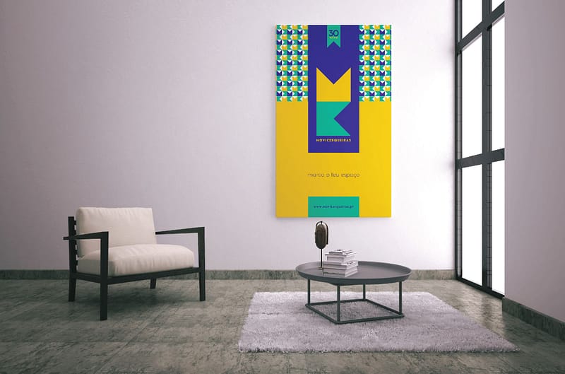
Movicerqueiras Movicerqueiras 2019 Brand project for Movicerqueiras furniture store.
Sushi Maketto
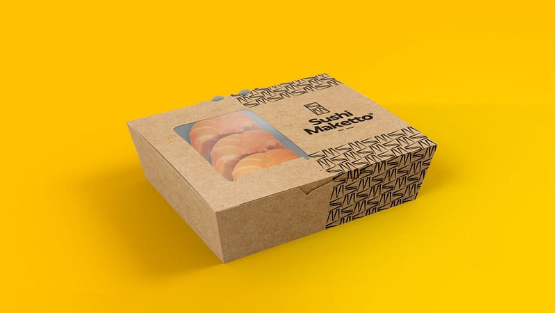
Sushi Maketto Sushi Maketto 2020 Sushi Maketto is a local sushi bar in Ponte de Lima. In reference to the place where their establishment is placed and to the Asian culture, they came up with the name “Maketto” which means “market” in Japanese. Trying to follow all these connections, this rebrand was created from a very particular […]
GRWind
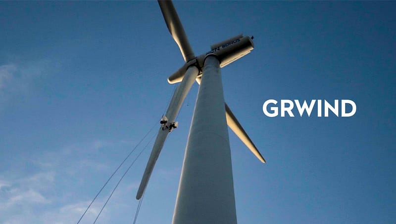
GRWind GRWind 2019 Wind turbines need regular inspection and maintenance, as well as necessary repairs. GRWind provides the protection and security necessary for wind farms to maintain high production values. The basis for GRWind’s new image creation appears, proving to be a brand that transmits trust, quality, accuracy, with plenty of strength and visual impact.
Kiwitos

Kiwitos Kiwitos 2020 Kiwitos, a brand of organic mini kiwi fruit produced in Ponte da Barca – Portugal. The customer requested a modern and familiar brand, as the products would be on sale in several stores across the country and it’s a product that appeals from 8 to 80! Another request was for the brand […]
Oficina & Stand Motoqueiro

Oficina & Stand Motoqueiro Oficina & Stand Motoqueiro 2018 Development of graphic identity and printing of communication supports.
Pedro Canossa

Pedro Canossa Pedro Canossa | Electricity Service 2018 Branding project for the company Pedro Canossa | Electricity Service.
Poetas Bar

Poetas Bar Poetas Bar 2019 Poetas Bar is an old bar, that reopened its doors in 2017. The logo idea was based in the name of the bar – “Poetas Bar”.
Quinta da Mata

Quinta da Mata Quinta da Mata 2015 Quinta da Mata is a rural tourism and wine production farm that consists of about 5 hectares of wine exploration and a residential area. From accomodation, wine production, traditional jam production, the area offers all the comfort to enjoy a relaxing environment.
Ambiclima

Ambiclima Ambiclima 2017 Ambiclima is a company specialised in HVAC systems and renewable energies. This logo was created by joining the letters A and C of the company’s name and its colours were inspired by a colour scale (hot and cold) referring to the temperatures of the HVAC systems.
Arcos Hotel Nature & Spa

Arcos Hotel Nature & Spa Arcos Hotel Nature & Spa 2016 Development of graphic identity, website, vinyl montage decoration and printing of communication supports.